Colours – how to use them in your office
The appeal of colours and the use of different colours is so subjective. We all have different opinions and likes when it comes to colours and how to use them. What I like, what I advise or suggest might not be your taste at all. However, colour experts agree that taking care in the choice of your home office colours will affect your mood and productivity.
What do the experts say?
When the study of color harmony is combined with the science of psychology, reactions can be predicted with startling accuracy. -Angela Wright (colour expert)
There is growing evidence that suggests that different colours affect our emotions, beliefs, our mood, attitude and happiness as well as our efficiency, imagination and creativity. Although colour has an impact on our psyche, it is the intensity that has the main impact. A subtle or low intensity will be soothing to us while a bold high intense colour will stimulate our senses, so the response we want must first be considered before the hue of the colour is chosen. This type of credible information can help guide our choices when planning the environment that we work in.
Colours that have a known Impact
Let’s look at each of the colours, what they stand for and how we can combine them to use in our office for increased productivity.
Blue
Blue is a refreshing calming and uplifting colour, dark blue is an intellectual colour. It represents efficiency, trust, communication, reasoning and sensibility. The colour of the sky and water, blue is a refreshing and calming colour great for areas you want increased productivity or people to trust you and be relaxed about it too. Politicians and newsreaders wear blue suits so we trust them.
Green
Green can be calming and stable but also energising, it offers balance and harmony. It is characterized in nature and is restorative, but it also represents jealousy (green with envy). Adding green into a room can be as simple as adding plants which will give a wonderful health boost.
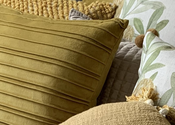
Yellow
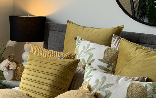
Yellow is a warm and emotional colour that is happy and friendly, it is optimistic, positive and confident. A great colour for increasing attention levels and preserving information, fantastic for cheerfulness, productivity and creativity. Yellow is great as a highlight but can be overwhelming if the whole room is painted in bright yellow.
Red
Red is a physical colour that is great for urgency, action and productivity as it increases the heart rate. It signifies leadership, power, courage and enthusiasm. If used in excess it can cause anxiety, aggression and competition between people. Red walls will leave you stressed trying to solve problems, it isn’t good for sustained attention and is exhausting. Remember the saying, we were red with anger mmmm….. says it all about too much red.
Pink
Pink has all the energy and warmth of red without the intensity. Pink is much more subtle giving it a calming, gentle and nurturing energy that represents femininity, romance and optimism. When pink is overused it can be draining, suffocating and emasculating.
Orange
Orange is a blend of red and yellow it represents, power, energy it is physical and emotional, it creates comfort freedom and fun. Think of the flower power from the ’60s, they used pops of orange in the flowers representing freedom.
Purple
Purple is a regal colour and often represented in spirituality idealism and sensuality, the right tones gives a sense of luxury, magic, romance and fantasy. Great for healing, meditation and wellness centres.
Grey
Grey is a neutral colour, representing sadness, depression, realism, it is often used to attempt to look sleek and modern but not a colour to use for accents as it can give the impression you are sitting on the fence and not confident about making a decision.
White
White represents purity and cleanliness. It is a great colour to make an area appear bigger and brighter, it is a great colour to add bright accent colours to as it adds balance and neutralises the brightness. Too much white can be clinical and boring especially if a bright white is used, a softer warm white can often be a much better choice as it is much easier on the eye.
Black
Black is a very bold colour that can look extremely classy showing dominance in an area. It represents sophistication, formality and pride. Too much black can be very masculine and dominant also depressive.
Pastel Shades

Pastel shades have the benefit of the full strength colours but include the benefits of calm and tranquil while boosting creativity and productivity. They are inoffensive and subtle which suits the majority of people. They are much lighter and brighter increasing the level of light in the room.
Do the office colours matter?
We spend a lot of time in our office working each week and being happy and productive matters. The overall home office set up and ergonomics is often our first and only thought. Choosing good colours for the home office could be as important as choosing the right storage solution or office desk. Any change in our environment so we are more comfortable is a change worth making.


I didn’t realize what a big part color played in how we felt and our moods. Thank you for writing this article.